Illustration Project Details
Here, you will see my sketches, initial ideas, and practices for each project.
Table of contents:
1. Social media campaign:
Engagement passivity
Tools: Clip Studio Paint, Adobe Photoshop

Concept
This series of illustrations depicts people's dependence on social media apps. By using complementary colors to create a hallucinatory visual effect, it implies that social media has become a part of our life. They are just like drugs, which brings us spiritual entertainment and makes us addicted to it.
このプロジェクトでは、ソーシャルメディア依存を主題にイラストを制作しました。彩度の高い補色を使うことで、幻覚じみた視覚効果を作り出し、今の社交アプリは私たちの生活の一部となり、私たちに精神的な娯楽をも��たらし、ドラッグのように私たちが依存するような影響を与えていることを暗示しています。
这一系列的插画描绘了现在人对于社会媒体软件的依赖,通过使用色调高的互补色制造一种幻觉般的视觉效果, 暗示着社会媒体软件现已成为我们的生活的一部分,就如同drugs一般, 给我们带来精神上的娱乐而让我们上瘾而对之爱不释手。


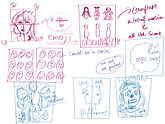
INITIAL IDEAS & DEVELOPMENT
Old results and visual outcomes


The initial appearance of this work is relatively simple, especially the picture on the right, which is entirely different from the finished product on the top right in the above section. Here, the message that "social media apps are everywhere in our lives" is constant, and I have made a logo of the most commonly used social media apps in various life scenarios based on my personal experience. The picture on the left is the initial state of the banner design that can be seen on the left of the above section. Here, I made slight modifications to the illustration to convey the message clearly without any text.
古いバージョンのこの作品は比較的に簡単な見た目であり、特に右側の画像は、上のセクションの上右側に見られるように、色鮮やかではありませんでした。ここでも、「社交アプリは私たちの生活の一部である」というメッセージは同じです。私は、個人の経験に基づき、「日常の色んなシチュエーションの中で個々最も使われる社交アプリ」をロゴに作りました。左側の画像はバナーデザインとなるイラストで、上のセクションの左側に見られる作品です。この作品について、私は、文字を使わずにメッセージがわかりやすく伝えるということを意識してにイラストに修正を入れました。
这个作品的初始外观相对比较简单,尤其是右边的图,和上面的section里面的右上方的成品比起来完全不同。在这里,“社交媒体软件在我们的生活之中无处不在”这一信息是不变的,我根据个人经验,我将在各个生活场景中最常用到的社交媒体软件做成了标志。左边的图是可以被在上面的section的最左边看到的banner 设计的初始状态,我在插画上做了细微的修改,尝试不用文字便可以清晰地传达信息。
2. Campaign design:
New Consciousness
Tools: Clip Studio Paint, Adobe Photoshop
Adobe Illustrator
Concept
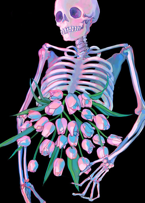
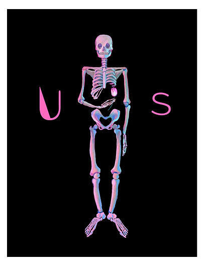
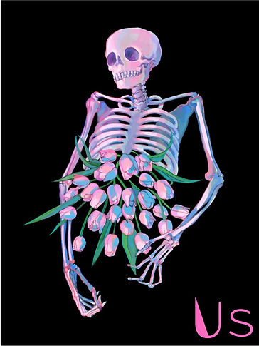
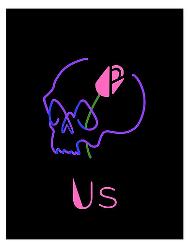
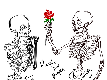
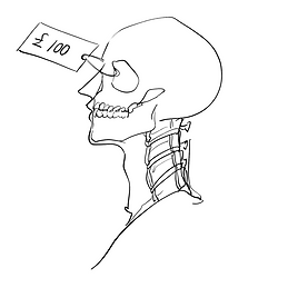
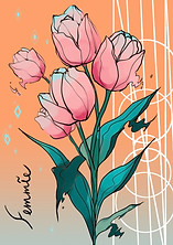
This is a series of designs of posters and campaigns. It is made to represent inclusivity. The skeleton represents equality, and the pink tulips symbolize love and passion. Combining both carries the message of loving yourself and others regardless of differences. The symbol of the campaign design is called “us” with the “U” shapes like a tulip. The name indicates that we all came from the same root, and the skeleton is what we all look like without any decorations.
これはシリーズとなっているポスターのデザインです。社会的包括性を代表しており、デザインに描かれる髑髏は平等、そしてピンクのチューリップは愛や情熱を表しています。これを組み合わせて、「差異に関係なく自他を愛す」というメッセージを伝えています。このデザインシリーズのシンボルの「us」の「U」はチューリップに見えるようにデザインをしており、その意味も「私たち」、つまり皆同じ場所から来ており、そしてその髑髏が私たちの飾りのない姿であることを意味しています。
这是一系列的海报和活动设计。它代表了包容性。骷髅代表平等,粉色郁金香象征爱和激情。将两者结合起来传递的信息是“不分差异地爱自己与他人”。活动设计的标志是“us”,形状像郁金香的“U”。这个名字代表了我们归根结底都是来自同一个地方,而骨架就是我们每一个人在没有任何装饰的情况下的外貌。


INITIAL IDEAS & DEVELOPMENT
Some sketches and experiments
Mindmap and Thumbnails:


Initial sketches:

Logo design developent:


Banner design developent:


I aimed to make the design simple but interesting enough to attract people's attention. I spent a long time deciding how to convey the message with a symbolic design; eventually, I used a skeleton as the motif.
Since the target audience is young people, I used pink and black as the primary colors as the color combination gives strong contrast, and it's prevalent in Pop culture.
制作する上で、私はなるべく簡潔でかつ人目を引くユニークさを持ったデザインを目標としました。象徴的なデザインでメッセージを伝えることに時間をかけ、最終的にどくろをモチーフに使うことに辿り着きました。このデザインは主に若い人たち向けに作ったので、テーマカラーはコントラストが強く、若者に人気なポップカルチャーでよく使われる黒とピンクにしました。
我的目标是使设计既简单而又有趣得足够吸引人们的注意力。我花了很长时间来决定如何用象征性的设计来传达主题,最终决定用骨架作为设计的模体。因为目标受众是年轻人,所以我用了有着强烈视觉对比, 而又在以年轻人为主的流行文化中所常见的粉色和黑色作为原色。
3. Reportage Drawing: My international friends
Tools: Clip Studio Paint, Adobe Indesign

Concepts
This is a reportage illustration project. Back in the days when we didn't have cameras, drawing was the recording method. It’s a type of visual journalism that sketches a location to tell a specific story. Based on this concept, I made a zine about my international friends and their past living experiences. They all have different cultural backgrounds and have lived in more than two countries. I prepared a few questions, mainly asking what they thought of the countries they had lived in and the advantages and disadvantages of both countries when comparing them. I recorded my interview with them and made a portrait for each of them as the zine cover. Through the zine, you can understand their characters and stories.
これはルポルタージュ・イラストレーションのプロジエクトです。ルポルタージュ・イラストレーションとは、まだカメラが発明されなかった時、人々が絵やスケッチなどでその場で起きた特定の出来事を記録手段、つまり一種のビジュアルジャーナリズムだったのです。このコンセプトを元に、私は私の国際生の友人たちを題材にしたマガジンを作りました。彼女らは皆違う文化背景を持っており、二つ以上の国で生活した経験を持っている。私はいくつかの質問を準備し、主に彼女たちが自分が暮らしていた国たちに対する考えや、二つの国を比べたときの良し悪しを問いたものになります。そのインタビューを彼女らの肖像画と一緒に記録し、マガジンにしたのがこの作品になります。このマガジンで、彼女たちの個性やストーリーが分かるでしょう。
这是一个报告文学插画项目。在我们还没有相机的时候,绘画是便是人们记录一切的方法。这是一种视觉新闻,通过描绘一个地点来讲述一个特定的故事。基于这个概念,我做了一本关于我的国际朋友的杂志。他们都有不同的文化背景并在两个不同的国家生活过。我准备了几个问题, 主要围绕着询问她们对于以前生活过的国家的想法,以及比较�两个国家时所发现的优点与缺点。我记录了我对他们的采访,并为他们每个人做了一张肖像作为杂志的封面。通过杂志,你可以了解她们的个性以及她们的故事。


Inspiration & Process
Daily ketches and doodles
STEP 1: Observation Drawings


To prepare for the project, I started by sketching my daily life. Sometimes, I would bring my sketchbook to a bar or a park, sketching my surroundings and other people. I would also take pictures of my favorite views and draw them home. In the latter case, I tried to paint them with different methods to explore a more unusual performance of the sketches, such as using forks or tapes as brushes or using shades to create shapes on paintings.
このプロジェクトを準備するために、私はまず日常をスケッチすることから始めました。時にバーや公園にスケッチブックを持って行ったり、時にはお気�に入りの風景を写真に収めて家でそれを紙に描きました。後者の場合、私は普段とは違う演出をスケッチに求めて、ブラシの代わりにテープやフォークなどで描いたり、影を使って形を描いたりしました。
为了准备这个项目,我从勾画我的日常生活开始。有时,我会带着我的速写本去酒吧或公园,速写我周围的环境和其他人。我也会把我最喜欢的风景拍下来,带回家之后再画下来。在后一种情况下,我尝试用不同的方法来画它们,为了探索一种更不寻常的素描表现,我试着用一些不一样的道具来代替笔刷,比如用叉子或胶带作为画笔,或者用阴影在画上创造形状。
STEP 2: Sketching & Interviewing
Photos of my friends' favorite things:


Sketches of my friends:


Records of conversations and interviews:

A stranger I met on the street in Leicester square, London.

A practice of a interview i had with my friend, Jing.
Throughout observation drawings, I decided to focus on figure drawings in the next step since I’m more interested in people’s personal experiences and stories compared to larger-scale events. To portray the aesthetics of the person I'm going to draw, I asked about their favorite things and belongings and included them in the portrait. In addition, I did sketches based on some of their pictures to portray them more accurately.
Step 1 で描いた色んなスケッチや練習を経て、私は規模の大きいなイベントよりを、人々の個人の経験に関した話に興味があると気づいたので、フィギュアドローイングを次のステップに定めました。絵のモデルとなる人物特有のやつタイルや雰囲気をも描写スロため、その人の好きなものや持ち物などの写真を本人達からもらい、ポートレートの一部として描き入れました。また、彼女たちをより正確に描くために、本人たちのソーシャルメディアに既存する写真を元にスケッチ練習などもしました。
在整个观察图中,我决定下一步将重点放在人物图上,因为相比于更大规模的事件,我对人们的个人经历和故事更感兴趣。为了描绘出她们每个人特有的氛围以及风格,我询问了他们最喜欢的东西和物品,并将它们也画在肖像中。此外,我还根据他们的一些照片画了草图以更准确地描绘他们。
4. Package Design:
Femmie
Tools: Clip Studio Paint, Adobe Photoshop
Adobe Illustrator

CONCEPT
ENG:
This is a branding/package design project called Femmie. I designed a multiuse cosmedic product that could be used as cheek powder, eyeshadow, or lip gloss. I designed it for women who want to get their make-up done properly but don't wanna carry too many cosmetics. I created the color pallet based on 4 types of flowers in different colors to give consumers a natural and organic impression.
JPN:
これはブランド制作のプロジェクトで制作した作品の「Femmie」です。アイシャドウ、チーク、リップ全てに兼用できる化粧品として、しっかり化粧したいが持ち物を多くしたくない、という女性たちのためにデザインしました。このブランドを実際の商品として店頭に並べた時、可愛くて個性のあるデザイン、またはオーガニックで肌に優しそうなイメージのある商品、と思ってもらえるように、それぞれが違う色の四種類の花たちをベースにしてカラーパレットを構成しました。
CHN:
Femmie是我在品牌制作中所设计的化妆品包装。这款化妆品可以被作为腮红,眼影,口红来使用。再考虑到女性们在日常生话中需要随身携带许多不同化妆品这一点的不便,我设计了这一款多用途的化妆品而达到减少女性们随身携带用品的目的。再考虑到此当商品被摆到店里时,我以有着不同颜色的四种种类的花朵设计了配色,希望可以给客人带来既好看又可靠的印象。


INITIAL IDEAS & DEVELOPMENT
Some sketches and experiments
First version of the design:


This is the first version of my design idea. I combined different types of female portraits with different themes. The purpose of it was to make a cosmetic brand that provides the color pallet that suits the person most. It was designed to save time and make make-up more joyful for women. However, I eventually abandoned this design because I felt that each design was stereotypical and might not be the best way to represent the person who uses the cosmetic.
これはこのプロジェクトを制作し始めたときに考えた1つ目のバージョンであり、違う見た目をした女性たちの絵とそれぞれに合ったテーマを背景にしたものです。このデザインの目的は、違う個性を持った女性たちにそれぞれ最も似合う色合いを提供し、その上で日々忙しい女性たちのために時間を節約し、化粧することをより楽しくすることです。しかし、このデザイン案には固定観念が含まれてるために、使用するその人を代表するには相応しくないと考えたため、採用しませんでした。
这是我所设计的第一个版本,其结合了不同类型的女性肖像与不同的主题背景。它的目的是为使用者提供最适合其的色调配色,此外还为了节省时间,让日日繁忙的现代女性们可以体验更多化妆所带来的乐趣。然而由于我意识到这里每一个设计图都富含着刻板印象,这种设计可能达到不了代表使用此化妆品的人的最好效果, 因此我最终放弃了这个设计版本。
Exploring & Practicing


After making the first version of the design, I realized that I want to create something more abstract and feminine. I started practicing drawing with different techniques and tools, such as using Adobe Illustrator to create simple editorial illustrations. I also explored symbolic art styles, pursuing drawings with more visually pleasant silhouettes by using simple shapes and smooth lines.
一つ目のデザインを制作した後、私はもっと抽象で女性的なコンセプトをつくりたいと考えました。そのためにイラストレーターを使った簡易的なイラストスタイルを練習したり、象徴的な画風などを模索し、より「見ていて心地よい形」をスムーズな線や丸みを帯びたシルエットなどで表現を試みました。
在做了第一个版本的设计后,我意识到我想要创造一些更抽象和女性化的东西。我开始用不同的技术和工具练习绘画,比如使用Adobe Illustrator创建简单的编辑插图。我还探索了象征性的艺术风格,通过使用简单的形状和流畅的线条,追求视觉上能够更加令人感到愉悦的轮廓。
Second version of the design:


In the second version of the design, I chose different flowers as the theme. What is different with the final outcome of this project is that the flowers in my final designs have a consistent style and color pallet. However, here, I aimed to make each of the paintings look unique and stand out, which caused them to lose the sense of unity.
この二つ目のバージョンで、私は違う種類の花たちをデザインのテーマにしました。最終案のデザインはこの二つ目のデザインと違って、個々の絵の配色とスタイルが類似色で描かれており、統一感があるデザインです。しかし二つ目のデザイ��ン案を制作するとき、私はそれぞれの絵がユニークであるように意識した結果、バラバラのスタイルになってしまいました。
在第二个版本的设计中,我选择了以不同的花朵作为主题。与这个项目的最终版本不同的是,最终版本的设计里,每一朵花都有着一致的风格和互相契合的配色。但是在这里,我的目的是让每一幅画看起来都很独特,很突出,这使得它们失去了统一性。


5. Book art:
Imaginary sea world
Tools: Clip Studio Paint, Adobe Illustrator, Adobe Indesign

CONCEPT
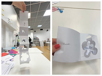
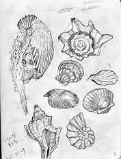
This is a pop-up graphic zine with Sea World as the theme. There are four pop-up art in the zine in total. Each pop-up art is made with a different paper folding technique. The illustrations for each page are designed based on seas with different environments. The Zine is developed in a bright, colorful design with simplified, cute silhouette creatures suitable for kid's books.
この作品は海の世界をテーマにした立体自主制作雑誌です。雑誌は全部で四つの立体アートからなっており、 個々の立体アートは違う折り畳みテクニックで作られています。その上、各ページの背景となるイラストは違う環境の海をもとにデザインしました。この雑誌は可愛くて簡易化されたシルエットの生き物と明るくてカラフルなデザインになっており、子供の絵本に向くように作りました。
这是一个以海洋世界为主题的弹出图形杂志。杂志中总共有四个弹出式图形,每个都是用不同的折纸技术制作的。每页的插图也都是根据不同环境的海洋而设计, 采用了明亮、色彩丰富的设计,配有简单、可爱的轮廓生物,适合儿童读物。


INITIAL IDEAS & DEVELOPMENT
Some sketches and experiments
STEP 1: Book design
Constructing book art ideas:


Making 3d abstact object along the theme "seaworld":


Practising different paper folding techniques for pop-up art:


Material testing for book cover:


STEP 2: Sketching & Practising
Pencil sketches:


Digital sketches:


Practical exersises:

.jpg)
